The TymbreIQ logo communicates the brand identity of a company that is both technology forward and human centered. The symbols rising from the “iQ” evoke the alert systems within emergency response facilities, while the typography itself has a softer quality that emphasizes the company’s focus on the people to whom its alerts are directed.
Human-Centered Alert Solutions for First Responders
TymbreIQ designs, builds, installs and services alert systems for first-responder facilities like fire stations. It stands apart from industry competitors in its focus on the health and wellbeing of emergency response professionals, and the company asked Supervox to create a brand that expressed both its focus on providing a better life for first responders and enabling more efficient deployment of teams and apparatuses.
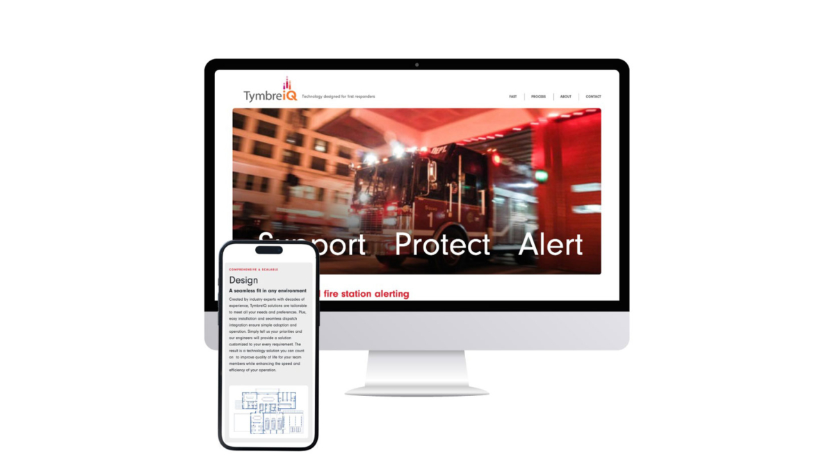
TymbreIQ Site Design
The TymbreIQ logo communicates the brand identity of a company that is both technology forward and human centered. The symbols rising from the “iQ” evoke the alert systems within emergency response facilities, while the typography itself has a softer quality that emphasizes the company’s focus on the people to whom its alerts are directed.
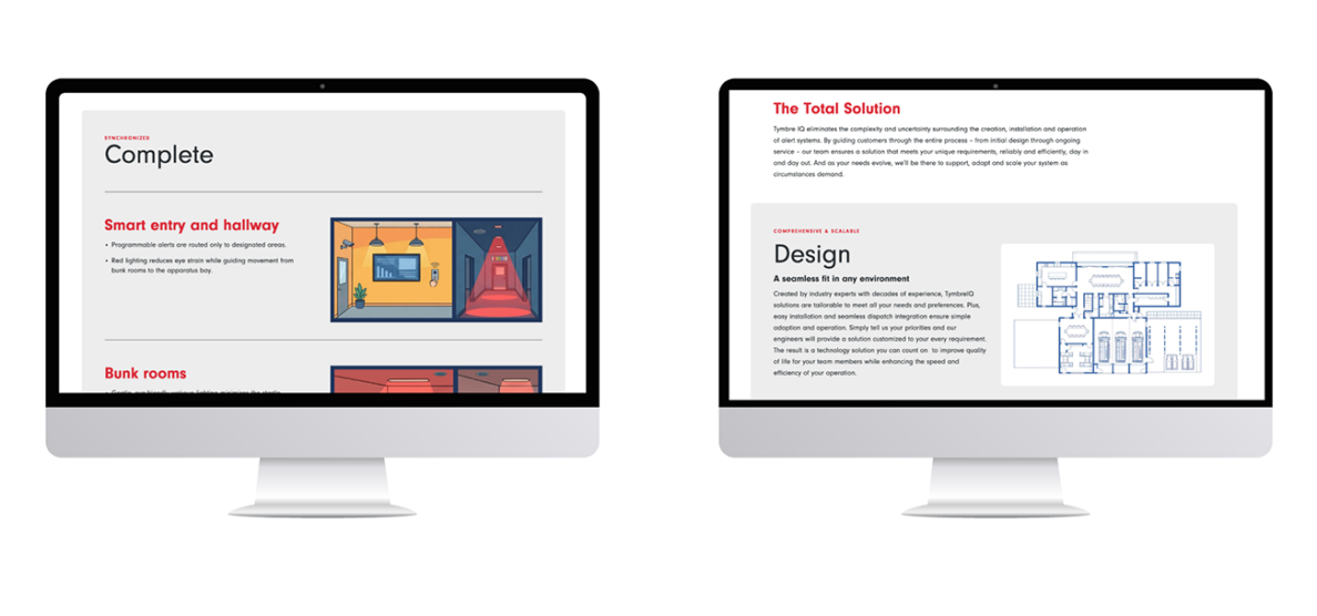
TymbreIQ Interior Pages
Too many technology company websites read like technical manuals. For TymbreIQ we wanted to distill complex information into easily understood and navigable sections that reinforce its human centeredness.
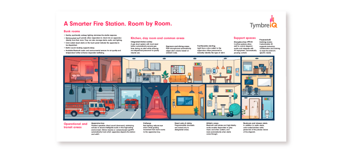
TymbreIQ Room Diagram
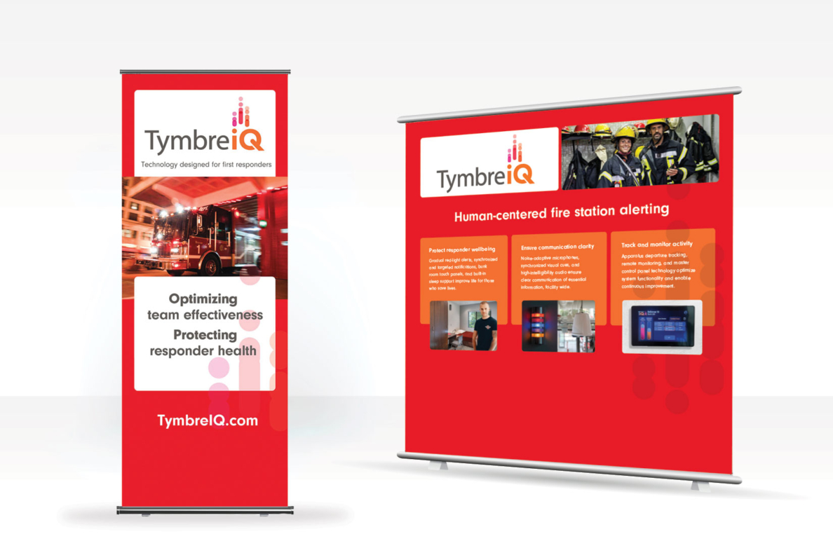
Supervox created a range of collateral that can be used both In face-to-face meetings and as leave-behind resources. Our objective was to communicate the comprehensive, unified, and customizable nature of the solutions TymbreIQ provies.
TymbreIQ Trade Show Signage
Too many technology company websites read like technical manuals. For TymbreIQ we wanted to distill complex information into easily understood and navigable sections that reinforce its human centeredness.